

Lawrence & Larimer
A responsive redesign for an e-commerce site.
Overview
CLIENT: Lawrence & Larimer
ROLE: UX Designer
TOOLS: Sketch, InVision, Photoshop, Zeplin
PLATFORM: Mobile Responsive Site
TIMELINE: 3 weeks
TASK: Redesign an e-commerce website to make the online shopping experience more user-friendly.
In April 2019, I redesigned an e-commerce website to improve usability for a shop called Lawrence & Larimer. Lawrence & Larimer is a locally owned clothing boutique shop located in Denver, Colorado. They are known for designing all of their products, most of which include unique references to living in Denver. Since their products are designed by the owners, they have many exclusive items that are only sold in limited amounts.
Lawrence & Larimer has a strong social media following, especially on Instagram. Many of their repeat customers come into the shop after they see a post about a new product or event.
Even with such a strong social media following, the store noticed that their online sales weren’t anywhere near in-store sales. Lawrence & Larimer needed a way to make their online store more user friendly while showcasing their brand style.

User Research
METHODS:
Competitive analysis
User interviews and reviews
Business owner interview
Contextual inquiry
Heuristic evaluation
At the start of my research, I focused on learning about Lawrence & Larimer’s current and potential customers. I wanted to understand their online shopping behaviors, what they liked or disliked about online shopping, who shopped at L&L, and why visitors visited the store.
Initially I conducted a competitive analysis to see how L&L stacked up to similar shops in the neighborhood. I looked at other locally owned boutique apparel shops, such as Coloradical (located a few blocks from L&L) and Queen City (also located in Denver). I looked at what their customers were saying about their experience with those stores and compared them to what people were saying about Lawrence & Larimer. Most shoppers loved almost everything about shopping in these stores, but there wasn’t much information about what their online shopping experience had been like at any of these locations.
Since there wasn’t much information about the online shopping experience of these shops, I asked potential customers about their general online shopping behaviors. To gain a better understanding of L&L’s current shoppers, I visited the brick and mortar shop to conduct a contextual inquiry and to speak with the owner(s) about their thoughts on who they are as a brand and who their customers are.
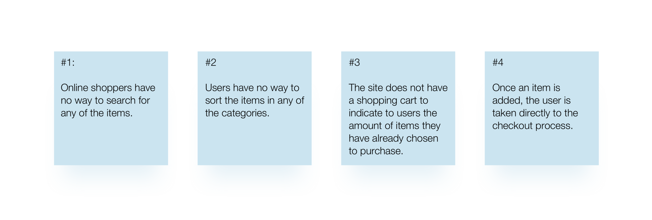
Within my research, I also conducted a heuristic evaluation on L&L’s current site to test the usability of the site. Was is convenient? Was there anything that was interrupting the user flow of buying their items online?
Key Findings…
… from the Interviews and Contextual Inquiry:

… on usability from the Heuristic Evaluation:
Who are the customers?
With my research, I was able to develop two personas that exemplify the two main types of customers that shop at L&L - a traveling first timer and a stylish regular. Based on customer reviews, the interview with the owner, and my observations during the site visit, it became pretty apparent that L&L’s customers were usually either traveling visitors randomly stopping in to look for gifts or repeat customers that came in regularly, especially when new items were promoted on Instagram. Both of these types of customers love their experience with the store, but have different problems with purchasing the items they love.

Beth, the first time traveler
Traveling first time customers, like Beth, stumble into the store while walking around Denver or while waiting for a table at a nearby restaurant. They want to buy souvenirs and gifts for family and friends back home, but don’t have the time to look at all the items or the space to carry all of the items with them. They need an easy way to buy multiple items online and have them delivered to their home.
“I love getting unique, non-cheesy souvenirs and gifts when traveling.””
Kenneth, the stylish regular
The stylish regular, like Kenneth, visits the store periodically, but mostly follow the store’s Instagram account. Whenever L&L posts their newest products, the regular will try to head to the shop as quickly as possible since they know that there are only a limited amount of each item. They need a way to purchase the limited items they see on social media as soon as it is available, even if they can’t make it in to the shop.
“I’m always on the lookout for clothes that make you feel exclusive walking around any city, knowing there’s not many people rocking what you’re wearing.”


Ideation and Sketching
For my initial sketches, I started by drawing out how the site navigation would look and what the main pages would look like. User interviews showed that customers would shop online if the ordering process was easy to use. This meant having clear information architecture (IA) that made sense to the users. It also meant that the site needed to have clear legibility of their products and seamless user flows.
Solutions
Create an easier way to buy multiple types of items
Include a responsive cart to show customers how much they have added so far
Add a search option for users to find products they find on social media
One of the confusions users had during usability testing was whether or not they could add more than one different type of product to their cart. When a user added an item to their cart, it automatically reloaded the page to the checkout page. Users needed to hit the back button on their browser in order to go back to add more items. This made users feel unsure about whether or not the currently added item would still be in the cart. The site also did not have a cart on the main page, so users didn’t know how many items they had added. Another element missing from the current site was a way for customers to search for items. Users also liked having the option to search for and filter items.
Final Site

After sketches, I built out block wireframes of the pages for usability testing. Based on the information I received, I simplified the checkout page, redesigned the search bar, added in an option to rate and write reviews on products. Since many of their customers found their products through Instagram, I included an Instagram feed of L&L’s products on most of the pages. I ultimately ended up changing the style of the site. The original site had small text and a dark blue background with yellow text. My final version simplified the design - I changed the background to white and added in simple black san-serif text for easier legibility on both desktop and mobile.
Next Steps
There are a handful of features I would like to include in the future on this conceptual design. Some of these include adding notify options for sold out products, adding quick look features on product listing pages, adding a favorites button for each product, include sizing info on product description pages, and having a feature that would allow customers to purchase products directly from an Instagram post (removing the added step of searching for the item on L&L’s site).